by Alexandra I.Mas
When you think of luxury and craftsmanship, the name Hermès immediately comes to mind. Founded in 1837, this family-owned business has evolved into an iconic brand that epitomizes elegance and refinement worldwide. Hermès‘ unique identity is steeped in a rich heritage that began with equestrian expertise and, over almost two centuries, expanded into the exclusive realm of high jewellery. The first pieces drew inspiration directly from the equestrian world, crafted in silver and featuring enduring motifs such as the bit (le mors), stirrup (l’étrier), saddle strap (le filet de selle), and chain link (le maillon de chaîne).
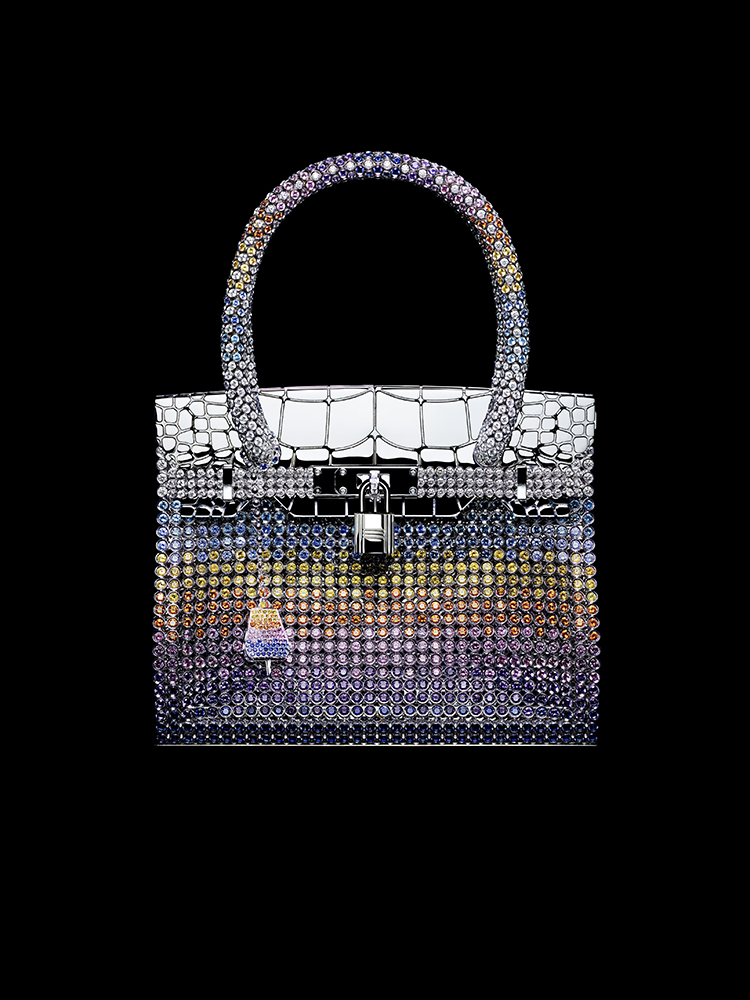
It wasn’t until 2010 that Hermès unveiled its first high jewellery collection. From the second collection onwards, the brand’s iconic handbags, Kelly and Birkin, were reimagined in exquisite, miniature versions, alongside interpretations of icons like Nausicaa and Chaîne d’ancre.
“This collection expresses colour in shapes. I wanted to find a way to express this fundamental phenomenon – of colour, at Hermès – and build a strong, autonomous and independent identity.”
Pierre Hardy, Creative Director of Hermès Jewellery

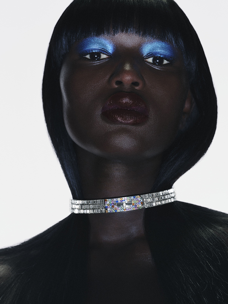
The geometric pieces in the chapter Color Flash, pavé-set with brightly coloured stones, resemble pixelated digital images. The unique and innovative construction of the necklace means it can be worn in a variety of lengths.
Hardy describes this collection as a thought process, an experiment in resonance between colors and geometry. This concept is beautifully illustrated in the “Portraits de la Couleur” chapter, where the red square of a ruby, the yellow triangle of a beryl, and the blue circle of a sapphire evoke a deep, almost genetic familiarity.

Ruby Ring
Rose gold set with a square-cut rhodolite garnet (3.25 carats), baguette-cut garnets, brilliant and baguette-cut rubies, and red lacquer.
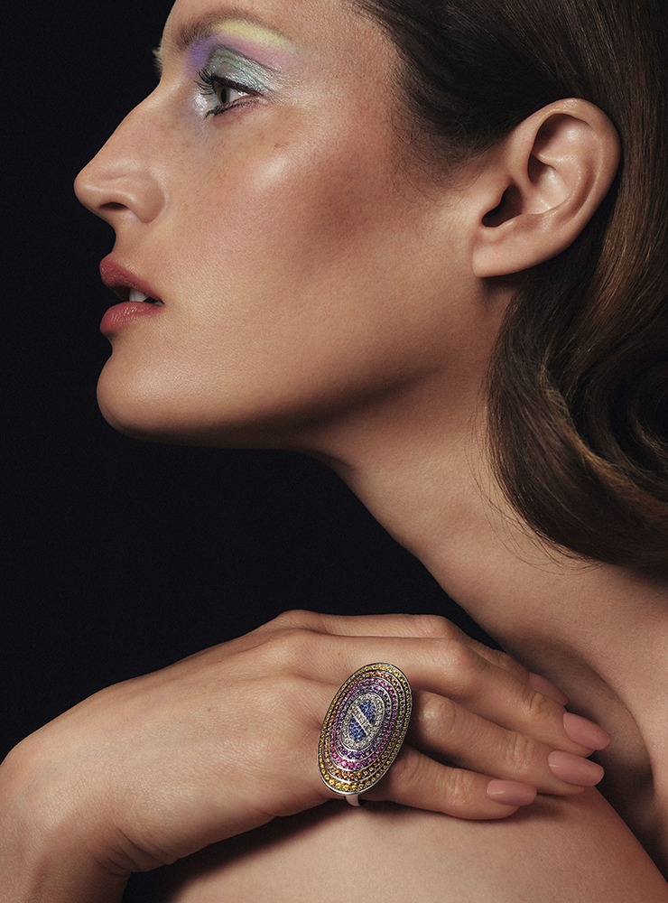
Rings
Rose gold set with a purple chalcedony (11.40 carats), purple sapphires, and amethysts.
Yellow gold set with a triangle-cut yellow beryl (1.53 carats), brilliant and baguette-cut yellow sapphires, and yellow lacquer.
Rose gold set with a sugarloaf-cut chrysoprase (6.02 carats), brilliant and sugarloaf-cut tsavorite garnets, and green sapphires.
Since the inception of the jewelry department in 2002, Pierre Hardy has been at the helm, embodying the enduring heritage of the Hermès house. As a master symbolist, Hardy embraces a spirit of freedom and exploration, particularly evident in the 2024 collection, which delves deeply into the realm of color. Chromatology, the study of colors, holds a profound significance in the arts, especially in France, home to many of this field’s pioneers.
Following in the footsteps of masters like Jacob Christoph Le Blon, Michel-Eugène Chevreul, Michel Pastoureau, Goethe, and Schopenhauer, Pierre Hardy illuminates “Les Formes de la Couleur” (The Shapes of Color). If chromatology could be materialized, it would be through precious stones. Hardy invites us on a journey through color, presenting a multifaceted collection where the invisible vibrations of color connect us to the world. This exploration bridges physics and poetry, weaving together our collective memory.
“I learned about the theories of colour during my art degree, and I re-immersed myself in them with passion and method to develop this collection. This theoretical study develops a hierarchy of colours (primary, secondary, tertiary), envisaging their relationships, their complementarities, their temperature, etc. Some pieces are based on these theories and lead to more narrative explorations. I like to start with something that is quite strict, defined and rigorous in structure, and then organise the diffraction from it. The combination of a colour and a shape sets the mind thinking: if red is square, what is that square saying? If yellow is triangular, the mind could fleetingly visualise the symbol on a superhero’s outfit, for example, or it could be linked to other memories, such as of a work of art, an album cover, a piece of architecture, or a feeling.”
Pierre Hardy

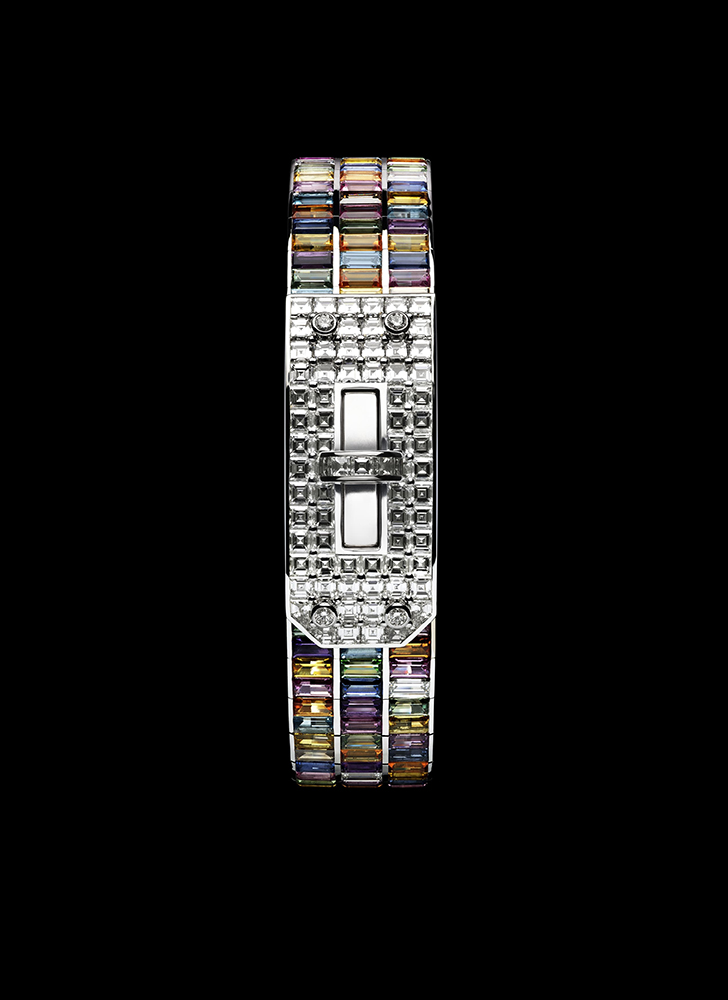
Supracolor chapter Necklace
White gold and platinum set with a triangle-cut rutilated quartz (18.41 carats) – set with a triangle-cut diamond (1.10 carats) –, baguette-cut diamonds, white, orange, and grey moonstone pearls, black and grey spinels, chalcedony, chrysoprase, rose quartz, and pink tourmaline.
The hypnotic, architectural and precious pieces in the Supracolor chapter including a one-off necklace, demonstrate the diffraction of light waves, the movement from black to white, and the appearance of rays of colour through the prism of rutilated quartz set with a dazzling triangle-cut diamond.

The supple, undulating shapes in the chapter Arc en couleurs mould to the curves of the body, and their soft colours invite reverie. The articulated bracelets and necklaces are the result of ingenious technical prowess in mesh work. Nearly 1,400 stones were selected for the colour gradient of the necklace.
“Colour is very much in evidence at Hermès: there is even a colour library for silk that contains almost 75,000 references. Paradoxically, this is the first time in the house’s history that such a wide variety of stones has been used in haute bijouterie: we have emeralds, rubies, sapphires and diamonds, i.e. green, red, blue and white. Colour is a natural resource on which we can draw infinitely, and I wanted to explore the whole spectrum! In addition to precious stones, we have also used semi-precious stones to give us a broader, more precise palette. High-quality jewelling and stone-setting then produced subtle colour gradients. The work of the jeweller is an almost supernatural, magical transformation from one substance to another that involves organising a series of shifts from one universe to another: from sketches on paper to objects in stone and metal, from the theoretical to the ornamental, from a two-dimensional representation to a three-dimensional piece.”
Pierre Hardy
One standout piece from the collection is the “Fresh Paint” chapter, showcased on the cover. Here, precious and semi-precious stones take the form of brush strokes, simple yet evocative and artistic, capturing the essence of Hermès’ timeless creativity.
The ring, bracelet and necklace in the chapter Hermès Diaprés are made up of centre stones: emerald-cut white diamonds or sapphires that radiate a soft, coloured light. Their brilliance illuminates the architectural motif in iridescent mother-of-pearl, set off by baguette-cut, coloured stones and diamonds. To transpose the original design of the necklace, the mother-of-pearl inserts of this one-off piece have been individually cut to fit.


Hermès Diaprés Ring
Hermès cultivates a unique approach to haute bijouterie, inherited from its original métier as a harness-maker and saddler we have the Color Icons chapter presenting all that represents Hermes :
“Colour! This collection asserts the goal of inventing a vocabulary that moves away from the house’s recognisable shapes. A vocabulary of emancipation that embraces a certain sense of freedom, and involves jumping over obstacles, to use an equestrian image. This collection expresses colour in shapes. I wanted to find a way to express this fundamental phenomenon – of colour, at Hermès – and build a strong, autonomous and independent identity.”
Pierre Hardy: